

- Joseph O'Connor
- Oct 15
- 4 min read

Move over clean and contemporary minimalism—retro web design is making a bold comeback. Inspired by brands like Nokia and Adidas embracing "newstalgia," web professionals are now looking back to inform their future creations—and it’s a powerful strategy to help clients tap into the emotional connections people have with their past.
There are many ways to inject design nostalgia into your client sites, like using pixel art, vibrant color palettes, psychedelic fonts and old-school photos. Here, we explore 8 websites built on Wix Studio that will inspire you to make retro web design your next big move.

8 retro web design examples that take us back to dial-up days
01. Mac McAlister
02. Three Uncles
03. StrategyFolk
04. Praagya
05. Enigma
06. Treep Tours
01. Mac McAlister
LA-based creative director Mac McAlister knows how to evoke feelings of a bygone era. Her showcase website uses muted tones and faded imagery to thrust you back in time. The logo and header fonts are a nod to traditional print styles, while the tiny body text resembles something from an old stylish magazine. The main images feature subtle textures that enhance the retro experience. Honestly, we were sold on the footer’s cute retro-style social media icons alone.

02. Three Uncles
When Studio NinetyOne was hired to create a new brand identity and website for London-based Cantonese restaurant Three Uncles, it wanted to tell the founders’ story and their Hong Kong origins “without being cliche or predictable.” The studio played it smart, using photographs from the founders' private family archives, which feature as halftone images on the homepage’s hero fold and the Our Story page. It’s a great example of how retro design can bring authenticity to a brand’s story. “The branding, full of energy, emotion and nostalgia, has helped the client reach a wide audience,” according to Studio NinetyOne’s website. “The Chinese community relates to it, but it also appeals to local Londoners thanks to its pared-back and confident style.”

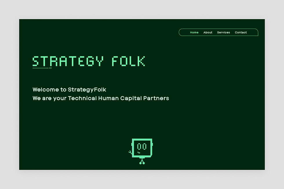
03. StrategyFolk
The website for recruitment firm StrategyFolk is a fine example of B2B web design using retro elements to grab attention and connect with visitors. The pixelated header font and square-faced character that appear throughout the site hark back to the days of the Atari 2600 video game console (another recent beneficiary of newstalgia) and add a playful twist to what is otherwise a clean and neatly laid out B2B website. On the homepage, StrategyFolk describes itself as “a very different resource sourcing firm.” With its cool nod to retro, we believe them.
04. Praagya
Praagya Bahuguna's portfolio site is an homage to old media, primarily print design and analog video. Its homepage’s large, bold red and angled font juxtaposed with a background resembling old TV static tells you you’ve landed on something interesting. Creative hover interactions display retro-style art prints and even an image of a TV-VCR combo unit. (Remember those? Well, don’t be surprised if they make a comeback, too.) Click on the Netflix link to see Praagya’s brilliantly imagined print magazine by the streaming giant, another project that shows the designer’s love of blending old with new.

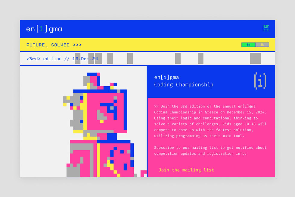
05. Enigma
Created by Danish branding and design studio Outlanders, the website for the en[i]gma Coding Championship is so vibrant and interactive that it jumps off the screen. Nicely tied in with the event’s theme, the creators went all in on retro computing using pixelated animations, classic game-like visuals and a bold color palette to grab attention. We’re fans of the monospaced pixel fonts that resemble those used for low-res display screens from the ’80s, the retro speech bubble custom cursor and the floppy disc menu icon in the top right corner.
06. Treep Tours
Mexican marketing and design studio Happy Tunna provides us with a throwback to Noughties design kitsch with the creation of a site for tour company Treep Tours. The standout feature is the hero fold’s hover interaction that displays the company name in different 3D bubble and balloon fonts. The rest of the homepage is packed with quirky animations, GIFs and text marquees, making it a memorable scrollytelling experience.
“We chose this approach because it is a great way to create an emotional connection with users,” as Happy Tunna’s Alexandra Navarro told us in our piece on design nostalgia. “Nostalgia provides a sense of connection to a simpler, more innocent time when everything seemed easier. In today's crazy and chaotic world, having something familiar and comforting can be very appealing.”

07. Words on the Move (template)
One of the website templates from our inspirational category, this retro-style site features a bold color palette and dynamic text marquees that add movement and flair. Its colorful and captivating imagery mixed with vivid geometric patterns have a striking visual impact. Try starting here if your client likes tons of color with a retro twist.

08. Excess Festival (template)
The 1980s are a favorite decade to draw inspiration from, and this event website delivers design elements from that period on a plate. Featuring iconic imagery like Pac-man, MTV and the Rubik’s Cube, the website offers an ideal starting point to build a highly engaging and nostalgic scroll experience for clients. Discover how to recreate it from scratch watching this Studio Academy build-along video.

Sign up for Wix Studio and build modern sites that draw from the past.
FAQ: Retro web design
What is retro web design and why does it work?
Retro web design blends vintage aesthetics—like pixel art, halftone textures, monospaced “terminal” fonts, and ’80s/’90s color palettes—with modern UX. It works because nostalgia triggers positive emotions and memory recall, helping brands stand out and improve engagement and conversions.
How can I create a retro-style website on Wix Studio?
One way is to start with a Wix Studio template (e.g., Words on the Move or Excess Festival) and customize with:
Fonts: pixel/monospaced/psychedelic display type for headlines; readable body text
Visuals: halftone images, grain, CRT/scanline textures, retro iconography
Motion: subtle GIFs, text marquees, cursor effects, low‑framerate animations
Accessibility: maintain color contrast and legible sizes while using retro palettes
Which industries benefit most from a nostalgic aesthetic?
Lifestyle, food & beverage, music/events, fashion, gaming, and creative portfolios perform especially well. B2B brands can use restrained retro cues—type choices, micro‑animations, or archive imagery—to add personality without sacrificing professionalism (as StrategyFolk demonstrates).

